
So after doing my research on where I wanted to go stylistically with my imagery for the ceramics was more of a traditional manner. This would mean to embark on trials of texture making mainly relating to that of my local pottery to make it a hidden meaning.
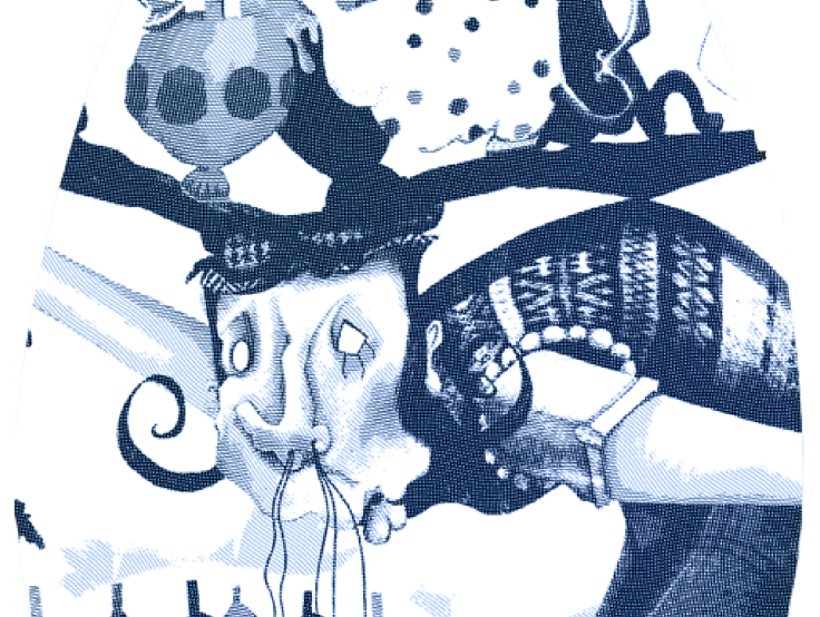
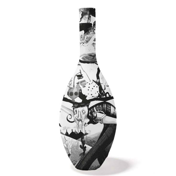
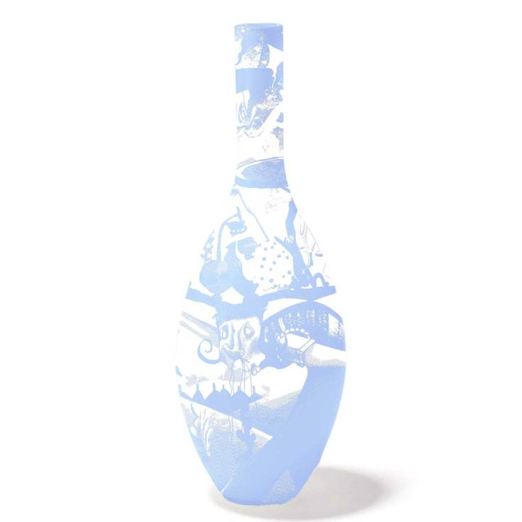
The first image is a previously drawn image at a place i use to work Emma Bridgewater – a pot bank. So you see how the etching, and even coloration (blues work great) add to the ascetic of what pottery normally contains, thus allowing it to blend.
One thing I have learnt is to not add too much detail and have a lot of open space. Also to have things in shapes makes the pottery become more structured, avoiding square or rectangular shapes if possible and mainly aiming for friezes or circular shapes (almost like masks).


Link right here.

Leave a comment